Sometimes, a cover makes you say "Aha!" whether you've read the story behind it or not. Sometimes it - as a dear friend of mine put it recently - "...makes me want to run for the hills. Screaming."
All of this has led me to ponder covers of books I've loved and admired over the years, some very recently, some going back quite a ways. And so, I present to you:
13 Book Covers Which Caught My Eye
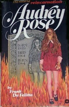
This is one of my earliest memories related to a book: spending hours (literally) staring at the cover of this book, trying to figure out what it was about. The book came out in 1974, and I recall holding this book when I was about five years old or so - if that - which would have been in 1976. I was fascinated/horrified by the imagery, but I couldn't understand the tombstone. It wasn't until I was old enough to cope with the concept of reincarnation that I finally got it. For the record, the book was my mother's.
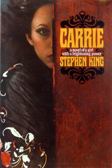
This was another one of my mother's books, from the same time period. I just sat and tried to understand what I was looking at - and failed miserably.
Once I was old enough to read them for myself, however, there was no going back.

This book is something which borders on the mythical for me. I've even blogged about it for Diiarts. (It should go up on their Power of Language blog in a few weeks.) The copy I purchased when I was about nine years old had this cover. It's burned into my psyche as one of the most beautiful and perfect covers for a book ever. I still feel you get a real sense of the tone of the book from the image - the hint of the downs beyond the rabbit (who, presumably, is Hazel); the muted, almost foreboding colors; the sense of scope in the perspective. It's a wrap-around cover, so the image of the treeline continues onto the back (where the great reviews are printed). I've often wished I had a print of the whole cover, minus the blurbs, taglines and titles. I love it that much.
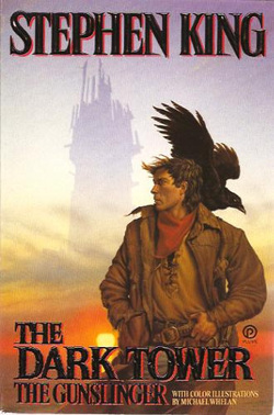
There have been so many different versions of this cover, it was hard to pick just one. I went with one of the more "epic" options, since even though the first book of the Dark Tower series was the shortest, it still had that sense of epic and grand adventure packed into fewer pages. This cover is no different. It has all the emotion of the whole series - the looming ominousness of the Tower itself; the rugged, not-quite-handsome gunslinger with the crow perched upon his back (which has got to make the reader wonder - if they haven't yet read the story - what the crow has to do with anything); the sunset which settles at the foot of the shadowy Tower. It makes me want to pick it up and read it all over again, especially to savor the perfection of that opening line.... sigh...
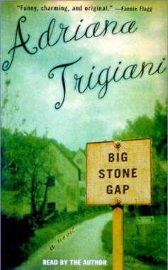
I first read this title because I used to live very close to Big Stone Gap, VA. (Yes, it's a real place.) I'd heard about it on the Today show when I was living in Florida, and decided to seek it out. A friend had a copy and hadn't enjoyed it (a teenager who'd never lived outside of cities, she couldn't relate to the small-town atmosphere of the story), so she gave it to me. This is a cover, however, which doesn't quite grab me in the usual way. Later covers were better, I think, but this is the one I saw first. I like how the author's name is done, and I like the ambiguity of the sign post containing the title. Beyond that, I'm not too keen. It needs a little more "oomph" to do justice to the story inside. And it's a great read. I promise.

This is a great example of how a simple photo can say a lot about the contents of the book. The simplicity of this cover is what really sells it, in my opinion. As I understand it, this is a reissue of the book, and all of Hornby's titles got similar treatments for their covers. This is my favorite of the bunch, since it really does give a sense of the story inside.

Some books I buy twice. Sometimes, I buy them twice for the cover. In this case, I bought it twice because I read it the first time in English, then read the Italian original. The Italian cover, here, is the exact one I own. I think it's absolutely perfect. You get the setting as described in the story - wheat fields stretching to the horizon, and ominous clouds dominating the scene. It manages to encapsulate the whole story, with vital elements from the beginning and the end. The fact the book is a stunningly beautiful read doesn't hurt.
The English translations have different covers, but the one I have here at home is particularly good, I think. Once again, the cover gives a strong sense of place as contained in the story. I can't recommend this novel highly enough.

The only thing that might be more surreal and delightful than this novel would be the countless different covers designed for it. And yet they almost always have one thing in common: Behemoth, the demon cat. Cover designers for this particularly strange and wonderful work of art seem to fixate on Behemoth. I'm led to wonder if many of those artists own cats and see some of their own demanding master pets in this character? My copy of the book is very similar to this one, except it has an illustration of the city (presumably Moscow, as that's where the action takes place) behind Behemoth and the piggy flying 'round the moon.

While you'd never know it from the cover, Destiny is a dark, moody and tragic tale, which takes place primarily in Italy. I love the fact that you don't know this based on the cover, but the bleak, numbing life of the narrator is epitomized by this image. Parks is simply one of the best writers writing about the reality of life for expats in Italy - his nonfiction strikes an exact balance between the bitter and the sweet - and his novels are equally perfect for their refusal to glorify life here. I adore him.
And hey - how clever is the insertion of the title and author here?
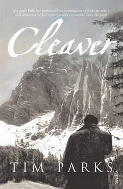
I grabbed this because Parks wrote it and I liked the cover. The contents didn't disappoint, and the cover is - again - a perfect image for the words inside. You get much of the feel right away - cold, distant, isolated - but the whys and wherefores are doled out in an enticing manner while you start to wonder if the protagonist's choice to journey alone to a remote reach of the South Tyrol mountains was a good one.

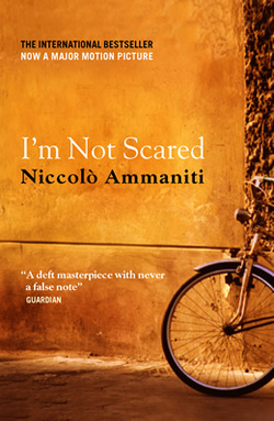
I like this cover for the very simplicity of it. It's one of those which makes slightly better sense in retrospect, too. I bought this before I knew there was going to be a film version. I'm glad I did. The film was beautiful, but there were some big departures from the content of the novel. Do a comparison sometime and see what I mean.
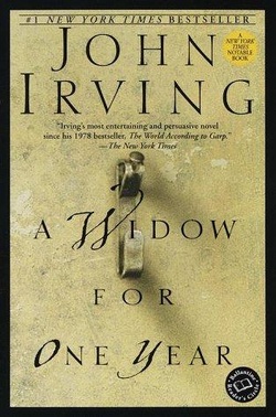
Another argument for "less is more". The picture hook is a key element in this story, but until you've read it, you can't quite understand the significance of it. Once you have read it, the impact finds you again and again. Unfortunately, when a film was made based on the first section of this novel, the movie tie-in cover was - in my opinion - just awful.

This one stands out for me because I just finished reading it a couple of days ago. It's not until you've nearly finished the novel that you understand the meaning of the cover image, but it speaks volumes once you get it. Less is more, once again, and the stark image of this cover is a rather literal take on a moment in the story. I'll let you read it if you want to know why it strikes home for the reader (and especially for the reader who happens to be a writer).
And there you go.
And here we go.
Since I didn't post a Thirteen last week, I suppose I have to make up for that.
And so, here you go:


 RSS Feed
